MoneyWorks Manual
Dashboard
The Dashboard section contains summary (dashboard) information about your company. These panels are a realtime snapshot of your current position.
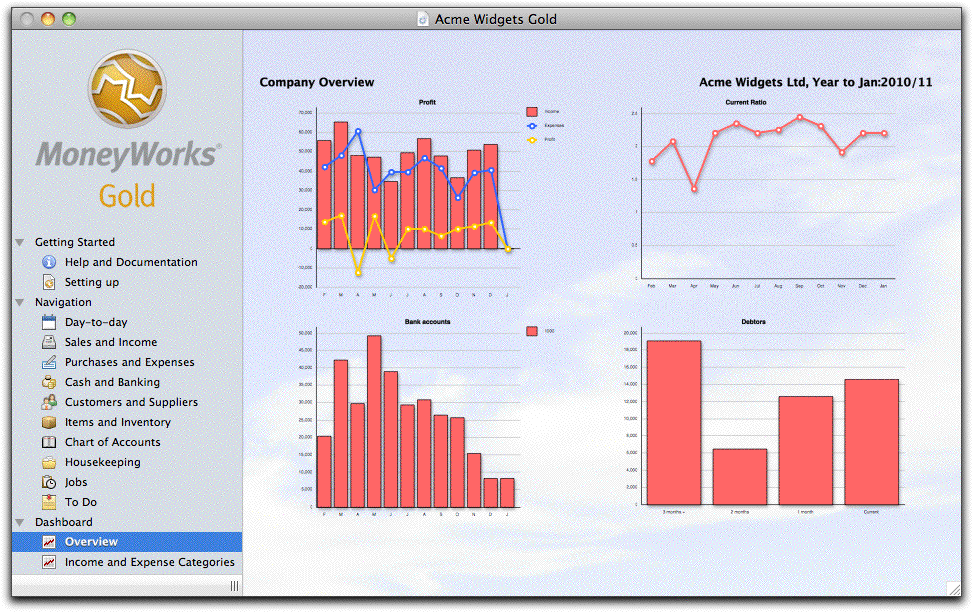
The Overview panel above is for the Acme Widgets Gold file. At a glance it can be seen that they are approaching an imminent cashflow crisis (the declining bank balance, bottom left), possibly caused by poor management of their Receivables (bottom right).
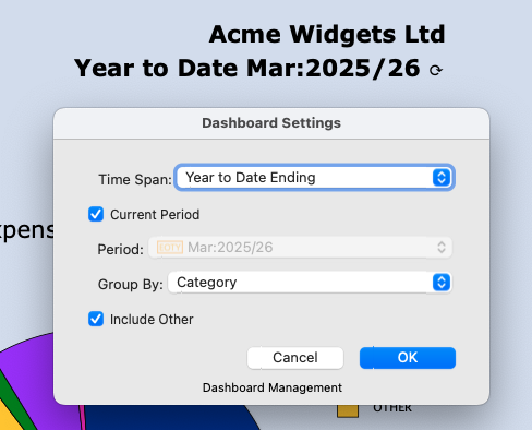
Tip: You can configure the display on the Income and Expense dashboard by clicking on the company name. This will open a settings window where you can set the chart to be grouped by any of the account attributes (category, category2, type, currency etc) for any nominated period. This allows you to explore how your pattern of income and expenses have changed over time.
Ledger Chart: This is a column chart of your ledger balances up to the current period. The options are controlled by the pop-up menu settings:
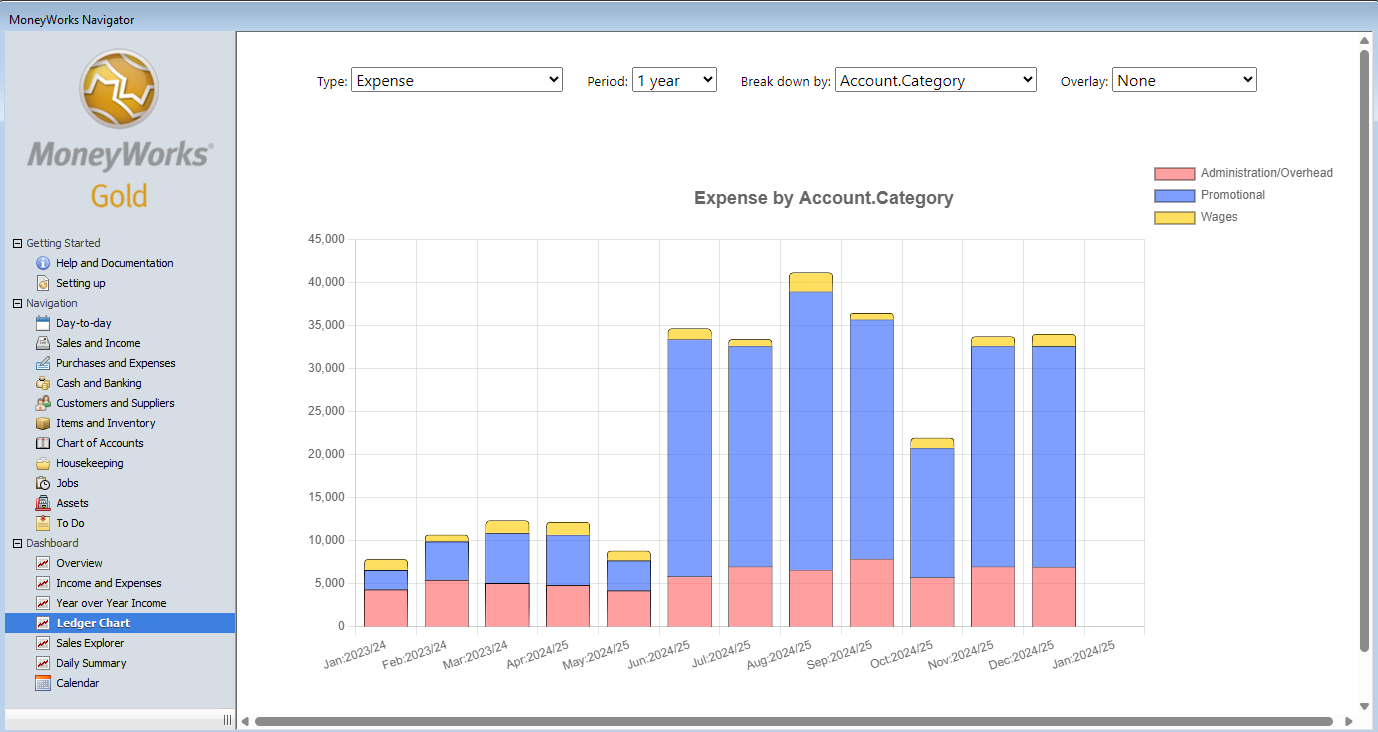
- Type: The type of accounts to display (e.g. Sales, Bank accounts). The two profit options will show the income and expenses, with a line for the difference (the profit). Filters you have added to the Edit option in the Select pop-up menu in the Account Enquiry window will also appear here as custom selections.
- Period: The number of historic periods to display. Each period will be represented by a separate column.
- Breakdown by: Use this to segment the columns in the chart for more granular information based on an account category, department etc.
- Overlay: Set this to add an additional line to the chart to show averages or budgets.
Clicking on a column segment will drill down to the relevant transaction lines (MoneyWoks Gold only).
Sales Explorer: These two bar charts allow you to explore your customer and item sales over time. The left chart displays the item sales, and the right displays the customer sales. Clicking on a bar in either chart updates the other chart to show just those sales for the clicked item/customer (called "cross filtering"). The options are controlled by the pop-up menu settings:
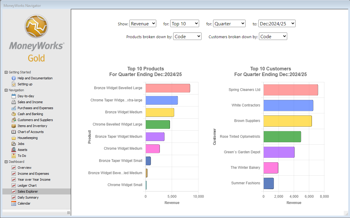
- Show: The data to display: Revenue, Cost, Margin, Quantity, Count (the number of transaction lines), % Margin. The margin is calculated as the average unit value of an inventoried item, or the buy price/standard cost for a non-inventoried items, at the time the transaction was posted.
- For: The top (or bottom) number of items and customers to display.
- For: The duration of the sales data (1 Month, Quarter, Year to Date etc).
- To: The end period of the data to display.
- Products broken down by: How to aggregate the product data (by Code, Category1, Category2, etc).
- Customers broken down by: How to aggregate the customer data (by Code, Category1, Category2, etc).
Note: To prepare the data, MoneyWorks needs to analyse your sales data for both products and customers for the nominated time interval. For larger data files, or longer time intervals, the analysis might require a number of seconds.
Tips for Ledger Chart and Sales Explorer
- You can force the charts to recalculate by right-clicking in the body of the chart and choosing Reload (Mac) or Refresh (Windows).
- On Windows, you can print the chart by right-clicking in the body of the chart and choosing Print. You can also copy and share the chart.